
How to Read Cryptocurrency Charts – 2024 Beginners Guide
We all know how rapidly digital currencies are gaining popularity all around the world. Many new people are joining this trade market every day in the hope of earning huge profits. If you are amongst them, you must go through this article to learn some essential skills before investing your money in cryptocurrencies.
For a new investor, it is sometimes challenging to do a trading analysis. But when you have the proper knowledge with you, nothing is impossible. Reading crypto charts is one such thing that every beginner and even experienced investor must know. This article will share with you how you can read the crypto charts that can make your trading experience much more manageable and impressive.
Sometimes, you may not have time to learn to analyze the crypto market due to your tight schedule or some other reason. In this case, you can hire a team of professionals that can help you in analyzing the trade market. If you are also looking for something exactly like this, then visit this site. The best part of this site is that they never compromise the security or safety of their clients.
WHAT DO YOU UNDERSTAND BY CRYPTO CHARTS?

Whenever you invest your money in cryptocurrencies, you must be aware of their position in the trading market. Cryptocurrency charts help in indicating all the points of profits and losses that occurred in any digital coin. In addition, the investors use these charts to predict the market value of cash in the future.
Most of the charts represent the current market values, quality, and volume of the digital currencies. The volume means how many coins of a particular currency have been exchanged, whereas the cost tells us the changes in expense of a crypto coin after some time.
The traders use two popular crypto charts to analyze the market:
- The Candlestick chart
- The line chart
LEARN HOW TO READ THE CRYPTOCURRENCY CHARTS
1. Candle-stick chart:
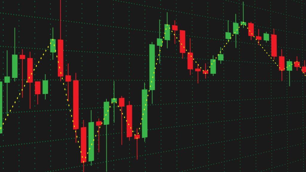
It is one of the most well-known charts that help brokers understand this business sector and how the market will move in the future. Let us learn how can you study this chart by having a look at its various elements:
Selection of time:
This feature of the chart allows you to select the time frame in which you want to study the cryptocurrencies. It means that you will be able to see all the transactions in that particular time frame. You can customize the time frame according to your wish. You can adjust the time frames for 5 minutes, 15 minutes, 1 hour, and even weekly or monthly.
Volume:
Another most important feature that is represented by the Candle charts is volume. But what exactly does volume refer to in these charts? Volume represents that number of activities or, in this case, maybe the transactions that a particular currency went through in the time frame that you have selected in the first step.
If you see that the bar showing the volume is long, it means that the selling or purchasing pressure is higher. Usually, green color highlights the increasing interest in any particular coin or pressure of buying. On the opposite side, the red color of the volume bar shows the fall in interest in any currency or the pressure of selling.
Two types – Bullish and Bearish candlesticks:

The green candles in these charts symbolize the bullish candlesticks, whereas the red candles are for Bearish candlesticks. Bullish candlesticks indicate that the coin’s price is increasing in a particular time frame that you have selected. Therefore, the bottom part of it is a bit thicker and represents the opening price of the currency, whereas the upper portion shows the closing price of the cryptocurrency.
The vice-versa of this goes with the bearish candlesticks ( red-colored), in which upper portions show the opening price, and the bottom one leads the closing price. Bearish candlesticks usually indicate that the coin’s price is decreasing over the time frame.
Line chart:

It is a straightforward form of Crypto chart in which the prices are indicated over some line. If you see a line moving upwards, then it shows that the cost of the cryptocurrencies is increasing, whereas you see the opposite results when the line falls downwards. This chart can be formed for any period, like months or even years. For example, a yearly chart shows the variation of the prices in these digital currencies over 12 months.
Daytime traders usually use these actual time line charts to see the price of any crypto coin at that particular instant. However, the market value of the coins fluctuates even within seconds. Therefore, it is beneficial to learn this diagram for the analysis. These are very straightforward to read and are an excellent tool for investors to understand what digital currencies have done so far.
The volume on the chart represents how many people are interested in buying or selling cryptocurrencies. Thus, the green color in the volume bar indicates more buyers, whereas the red color indicates more sellers.
If reading charts is not your cup of tea, you can use analysis tools to do that task for you. There are many technical tools available on the internet that can help you analyze the trading market. These tools can help you predict the prices of crypto coins more systematically.
TO SUM UP
We hope you have got some idea on how you can get started with reading the crypto charts. It is an essential skill for beginner investors that will help them in predicting the market trend of any cryptocurrencies. However, even if you cannot understand them, you have an option to purchase some technical analysis tools available on the internet.