The Most Commonly Used Graphs And Charts To Understand Stocks
Stock charts and graphs come in many different shapes and sizes. They are essentially utilized by day traders to help them determine the opportune moment to buy (or sell) a stock. The importance of these charts and graphs is huge in understanding both stocks and the concept of paper trading, where investors would write their investments on paper and follow the market movements.
Learning how to read these stock graphs and charts is especially important in the current pandemic stock market environment as extreme volatility can quickly lead to news-driven massive swings in the stock market. It is, therefore, important to only rely on fact-based stock charts & graphs to understand and time the meaningful changes in market trends for profitable transactions.
A thorough understanding of the stock charts and graphs also help the traders in navigating the pattern day trader rule (PDT), which is otherwise one of the most common grievances, especially amongst new traders.
If you’ve been looking to understand stocks a little better, here is your comprehensive reference guide to the many different types of charts and graphs available along with an overview of their potential uses.
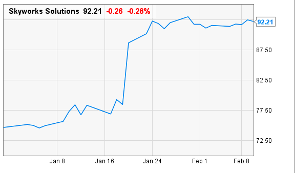
1. Line Charts
Line charts are one of the most popular types of charts used in stock reports to give a comprehensive view of the historical and current trajectory of stocks.
Made up of a single line from left to right, line charts connect the closing prices of the stocks (or any other specified price data point) at a specified time interval. The main objective of a line chart is to give a bird’s eye view of the historical prices of the stocks in a single line.
By drawing trend lines to connect the peaks and lows in line charts, you can anticipate both potential price inflection and breakpoints in stock trading.
Benefits of Line Charts
- Offers a very simple view of the stock price movement
- Helpful to use when you’re comparing the performance of many stocks on the same chart
2. Bar Charts
Also known as open-high-low-close (OHLC) charts, bar charts use vertical lines extending to the highest and lowest prices of stocks for the specified period along with a short horizontal line extending to both left and right to indicate the opening and closing price respectively. The color-coding of the bar charts is based on the net gain (green) or loss (red) on the stock closing price.
Benefits of Bar Charts
- Offers relative information to understand stocks by showing the range (high/low) of the days trading
- Leverages the length of the bar to reflect volatility or the strength of the trend
3. Candlestick Charts
Originated in Japan in the 1700s to mainly track the price action of rice futures, Japanese candlesticks were later introduced to other countries. One of the most popular charts used by stock traders, the candlestick chart is considered standard on almost all platforms.
Going by the name, the candlestick chart is composed of three main parts: the body, the upper tail (wicks), and the lower tail. The body is made of the opening price and closing price for the time interval and is colored either green or red. While a green candle is an indication that the closing price of the stock was higher than the opening price (bullish), a red candle is an indication of the closing price is lower than the opening price, resulting in a net price drop (bearish).
Benefits of Candlestick Charts
- To generate a candlestick plotted on a price chart, the chart utilizes the opening, high, low and closing stock price data as per specified time interval
- Easy to see the trends due to pictorial representation
4. Point & Figure Charts
Filtering out the distractions such as time and volume, point & figure charts mainly focus on the significant price moves. The charts are made up of X’s and O’s that represent net price changes for stocks.
While the X columns represent rising prices, O columns represent falling prices. The X’s and O’s on these charts display very easy trends to follow and draw trendlines. What makes the P&F charts unique is the fact that unlike line, bar, or candlestick charts, time input is not used on a linear basis in this case. As soon as the stock price rises or falls beyond a level, a new column is started.
Benefits of P&F Charts
- Easy to learn and interpret with few price patterns
- An excellent tool for doing stock price target calculations
5. EquiVolume Stock Charts
As the name indicates, EquiVolume stock charts are used to provide the solution of Volume at Price in a unique way.
The chart incorporates the volume into the price bars itself instead of plotting them in separate bars. What this reflects is the high amount of shares traded during the specified period if the price bar is wider.
Benefits of EquiVolume Charts
- Easy to interpret especially by new traders
- Aesthetically impressive
6. Volume at Price (VAP) Stock Chart
VAP stock chart has become one of the recent favorites of traders as it shows the volume of trades at a specific price level instead of showing volume for a certain time period.
The chart enables traders to easily see at what price level most of the traders/participants believe the stock is fairly priced.
Benefits of VAP Charts
- An innovative method of charting that allows the traders to see market psychology in terms of both time and price.
Bottom Line
Stock charts and graphs are an incredibly useful tool that allows you to easily navigate news-driven, volatile stock markets. Learning how to read charts/graphs may seem challenging at the beginning, but mastering them conceptually can help you both find the best stocks and learn how to buy/sell stocks at the right time.
Whether you use the weekly chart to gain a longer-term perspective on the stock and its underlying trends or daily charts to understand valuable price and volume action at specific, timely moments, a thorough knowledge of these charts can be a game-changer in your journey as a stock trader.